- Role
- UX/UI Designer — website
- Year
- 2026
- Recognition
- London Design Awards — 2× Gold
- Client
- Emerald24 · United Kingdom
- Tools
- Figma · Jira · ChatGPT · Spline
Emerald24
A companion bank website for business and private clients — solid as a stone, smart as a gem.

- 01Overview
- 02The challenge
- 03Process
- 04Foundations
- 05The pages
- 06Next project
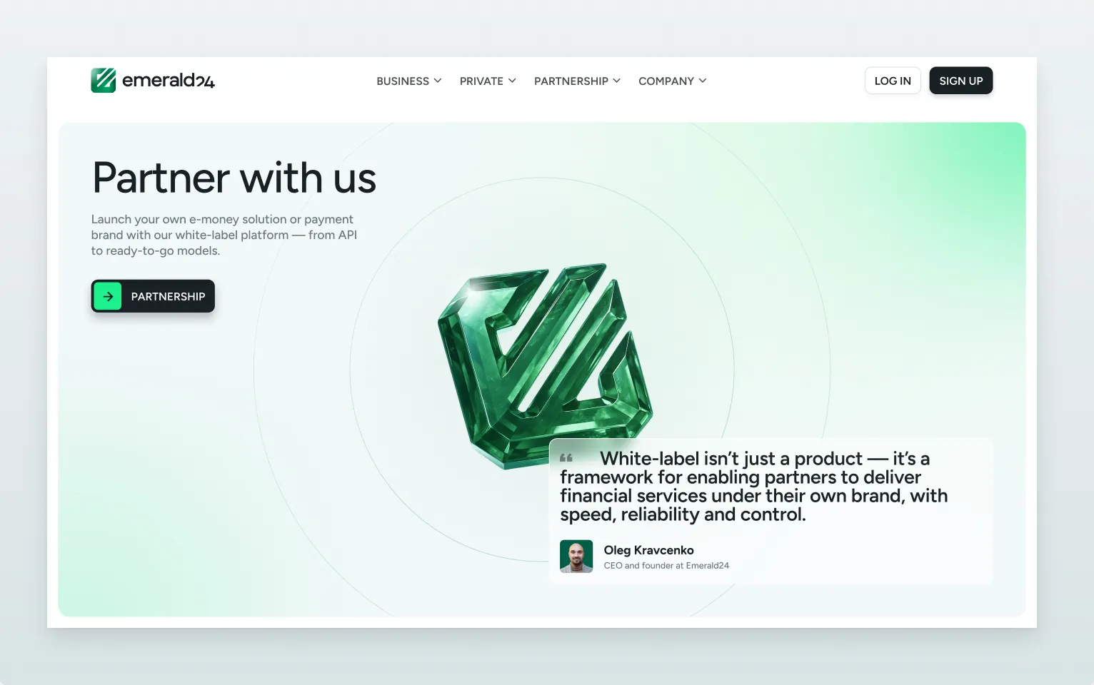
Emerald24 is a UK e-money institution: multi-currency IBAN accounts, cards, acquiring and white-label payments. I designed the website end to end — research, structure, wireframes, UI kit and the final responsive pages — so the brand feels friendly but serious from the first screen.
The challenge
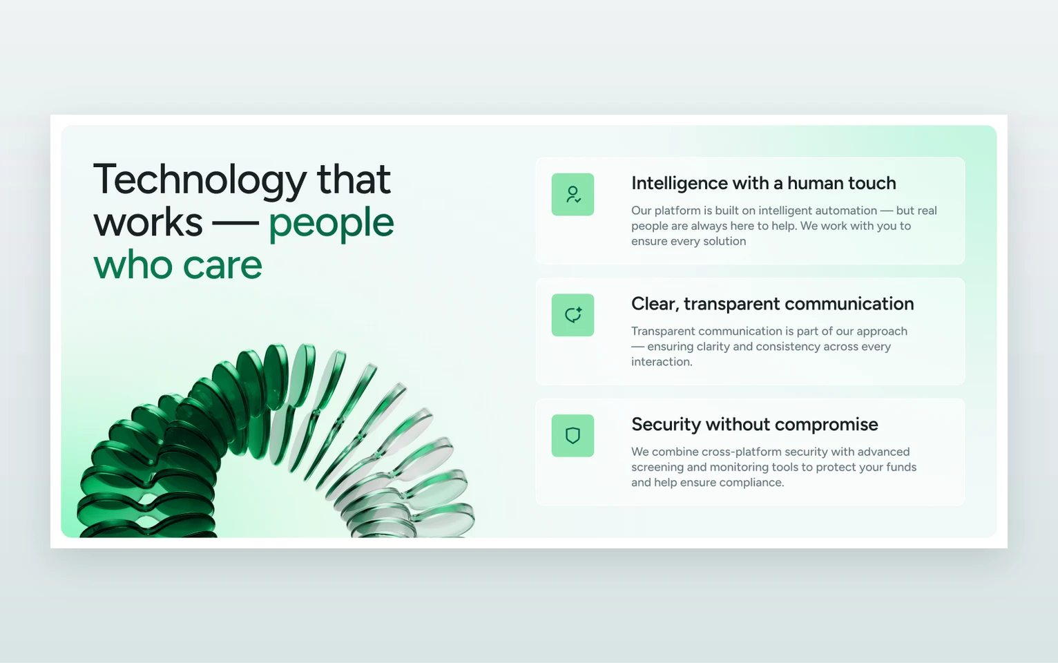
Clients are tired of banks that act like a policeman — endless forms, unexplained blocks. The site had to feel friendly but serious and earn trust without walls of text.
- 01Forms, blocks, no explanations
- 02Trust before features
- 03Friendly, but serious
Process
- 01
Discover
Audit of 16 competitor sites, from Revolut and Wise to HSBC, plus two personas and the brand story.
- 02
Structure
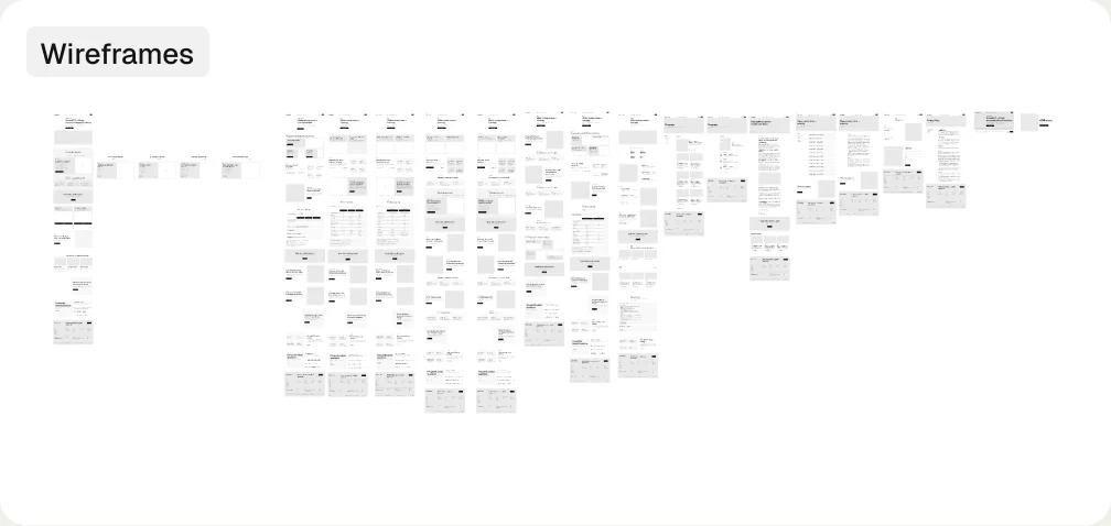
Website map, page structure and user flows; wireframes for 13 page types, from Home to 404.
- 03
Design
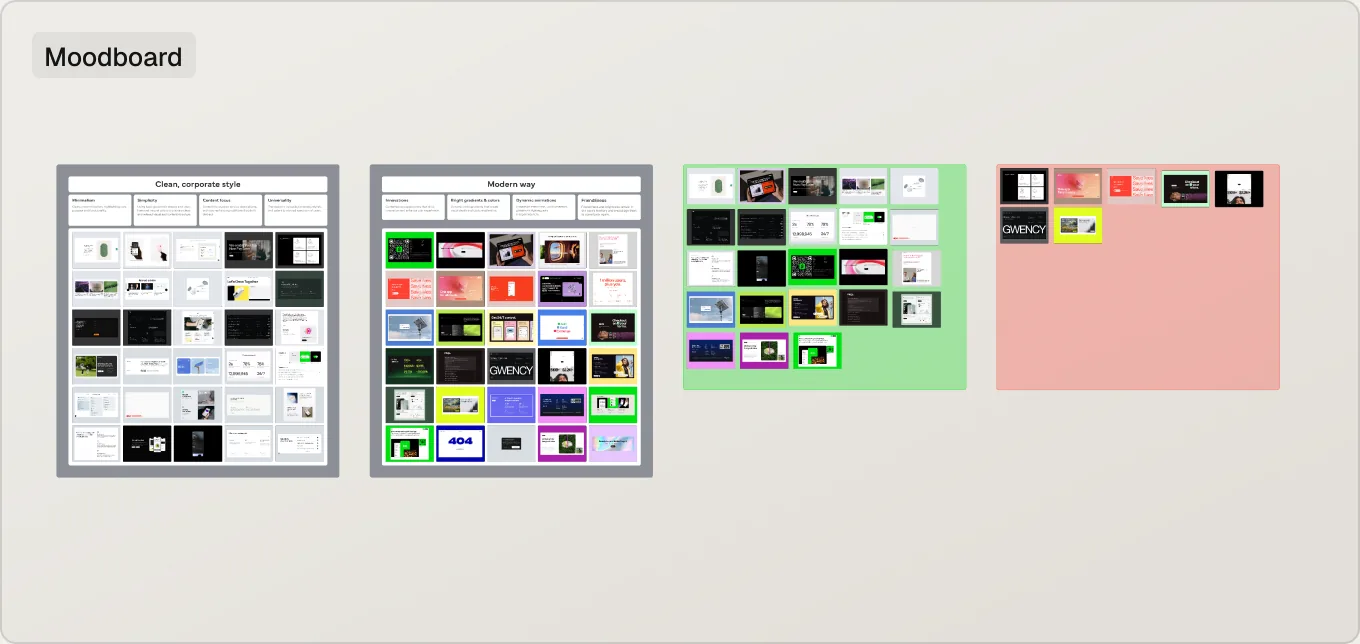
Moodboard and colour directions, a green glass visual language and responsive UI for every page.
- 04
Deliver
UI kit — buttons, inputs, menus, header and footer — and production-ready page designs.
Foundations
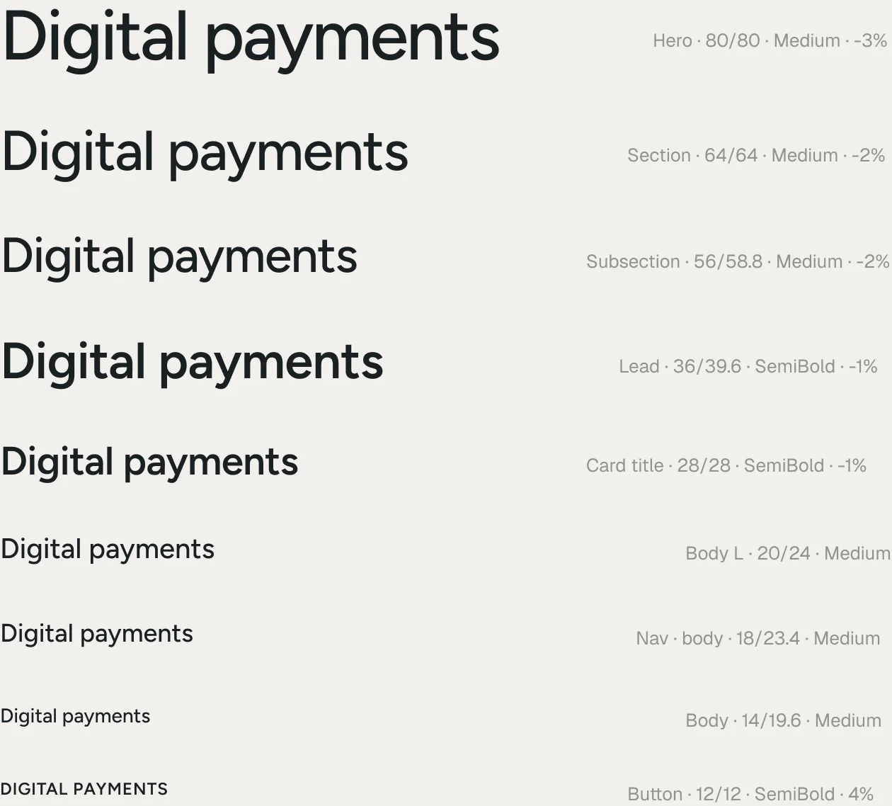
Measured on emerald24.co.uk: ink and white for type, emerald greens for brand sections, mint for the signature arrow tile. One typeface — Figtree — and an orbital glass mark.
- Ink · buttons
- Headings
- Body text
- White
- Mist · cards
- Border
- Emerald
- Green
- Leaf · icons
- Mint · arrow
- Light mint
- Light grey
The pages
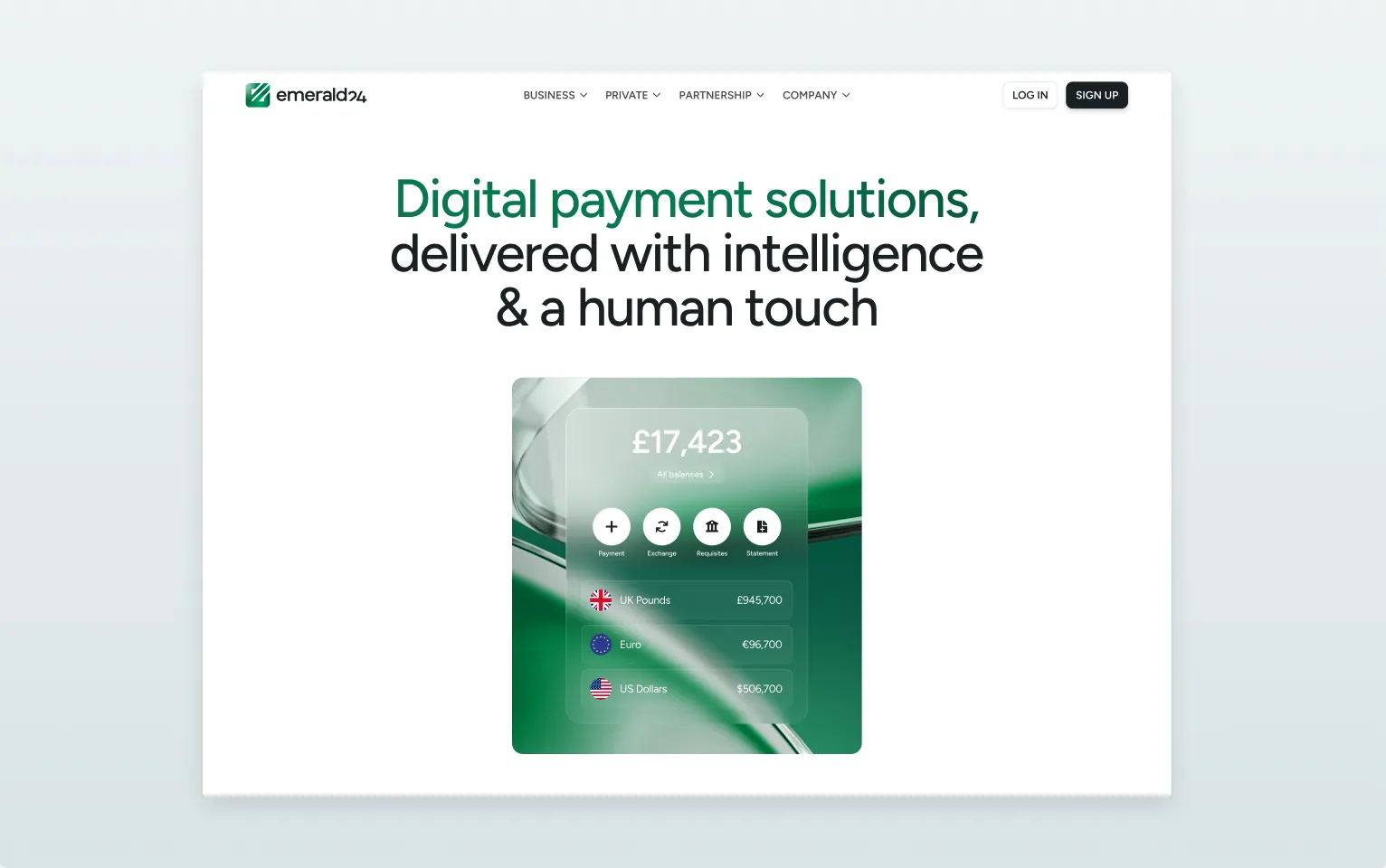
- Home
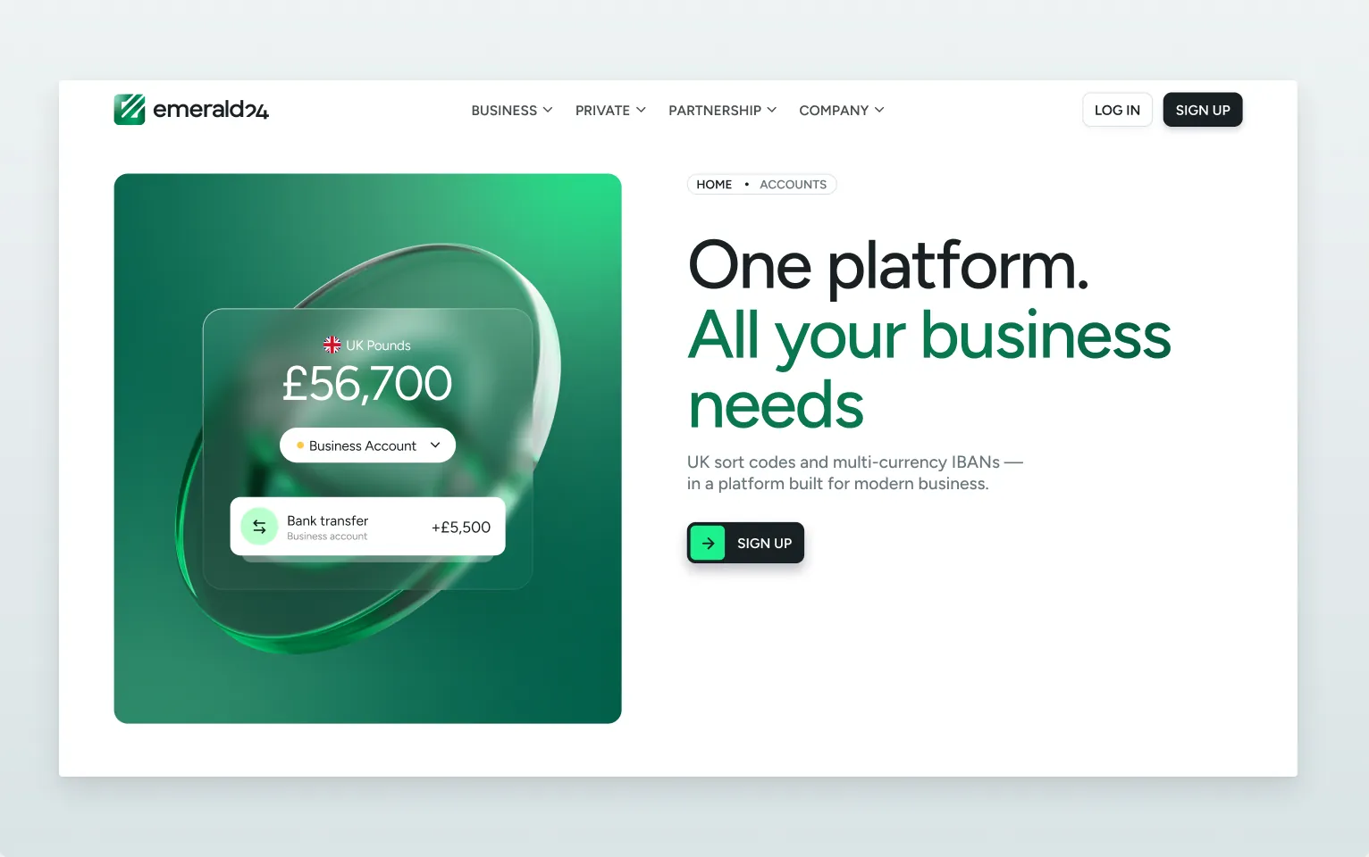
- Accounts
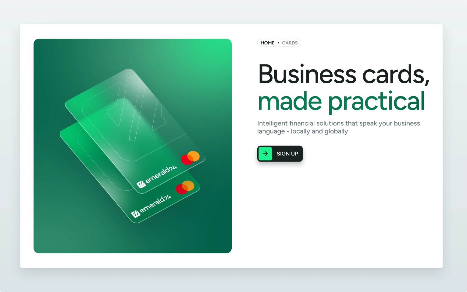
- Cards
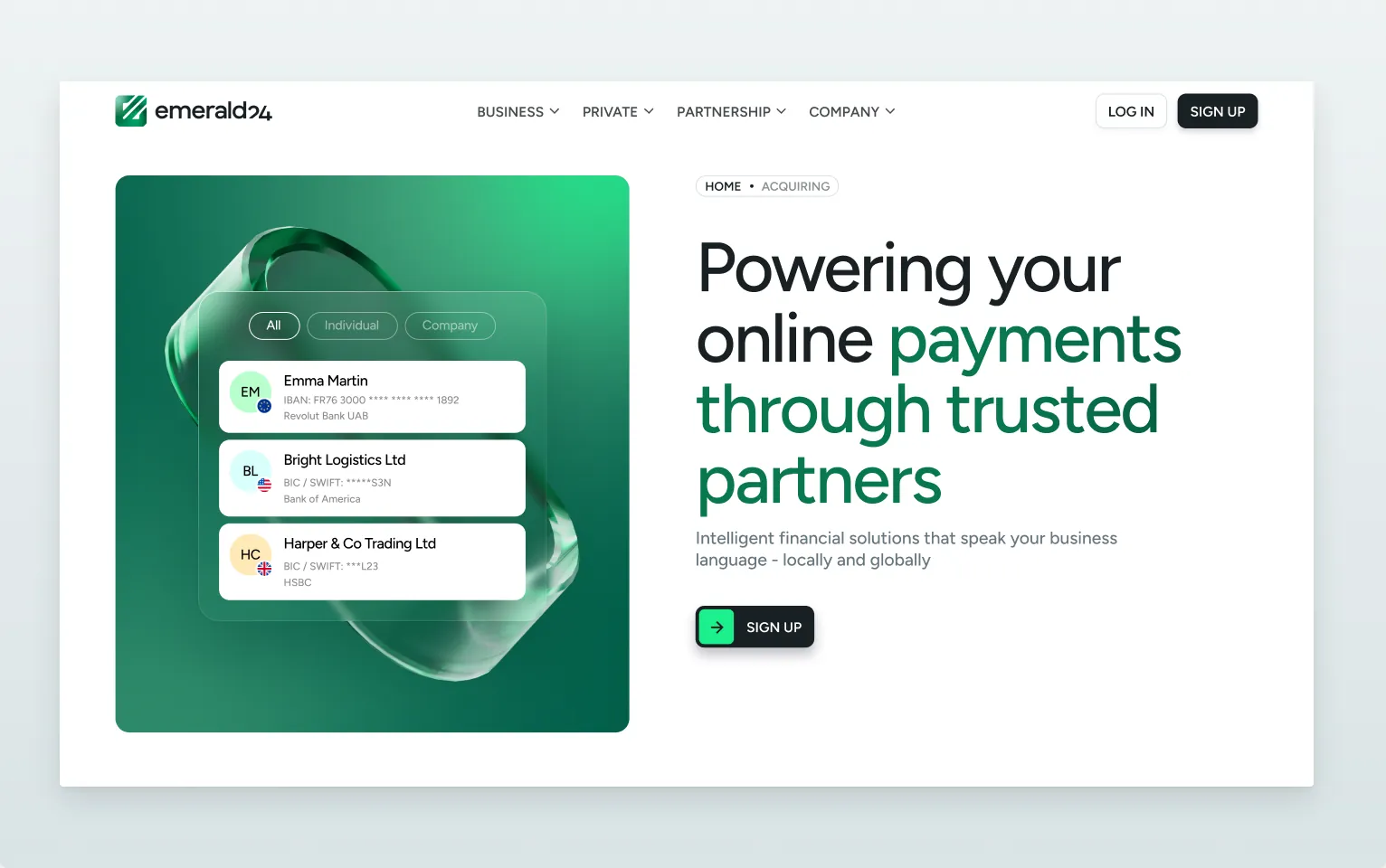
- Acquiring
- Partnership
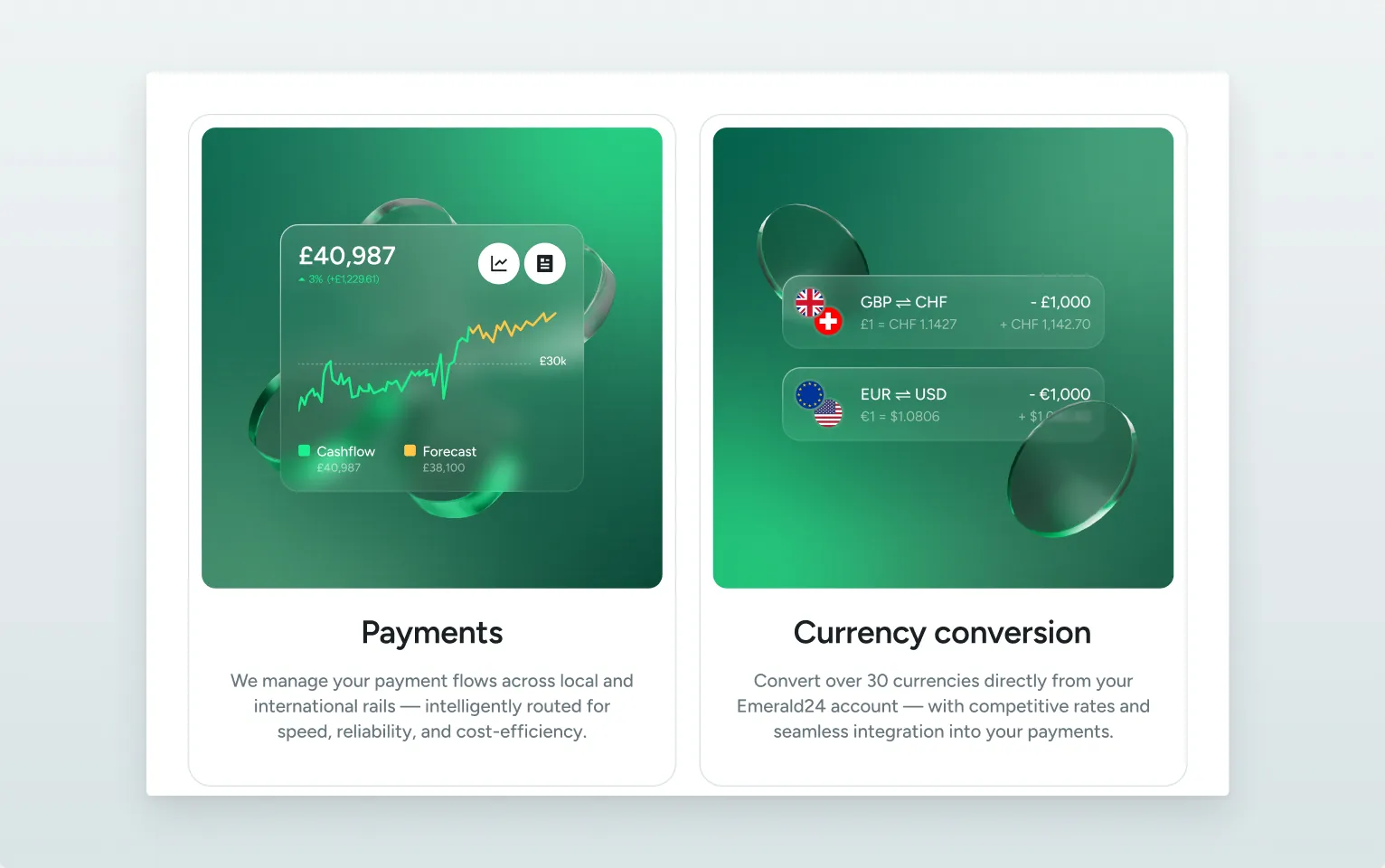
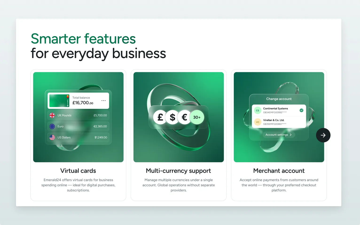
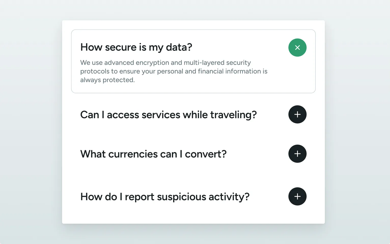
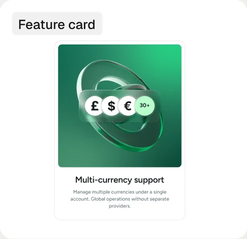
One long homepage read like a film strip, and four product pages that follow the same rhythm — hero, what you get, how it works, examples, call to action — so a visitor who learns one page can read all of them.
Visit website